Reports to Dashboards at June
June studied what and how to track products so users can understand their customers like the best companies do. This led us to autogenerated reports for from activation to retention and most things in between. When users land on June for the first time, they immediately get valuable reports. These metrics apply to all B2B SaaS companies. Over 80% of users keep these setups months after signup and conversion. And yet we decided to kill them.
Problem
June reports cannot be customised with more insights than what’s already in them by default
Reports are too easy to create leading to users unable to organize and find their most important reports
Reports are focused on single metric so it’s difficult for users to get an overall sense of their product usage health
Consistent customer requests for reports to be more flexible e.g report setup, insight types, visualisation, etc.
Not trusting report data as setup was hidden or changed by teammates
Process
Continuous discovery with design committee members. These are early adopters and paying customers in a shared Slack workshop.
Dogfooding June to understand customer product usage and setup
Shipping small improvements behind a feature flag and following up with customers that requested the feature for validation or understand evolved needs.
Iterating on each above problem individually before committing to dashboards as a solution
Exploring AI as a solution on top of existing reports
Continuous competitor research and design inspiration
Where we started from. One of our humble reports, the feature report. Other reports in June were similar, with just a handful of fixed insights and each insight constrained to the same setup.
Side note: How our feature report evolved
What we tried
Oh boy I haven’t seen some of these designs in years 🫠

Exploring different flavours of Home and understanding what the concept of Home means to customers in June. Just high-level metrics? Something more actionable? Should it feel live and always updating? What about data health? We learned people want more than 1-2 graphs, but what’s the right level of depth, what smart defaults can we show?

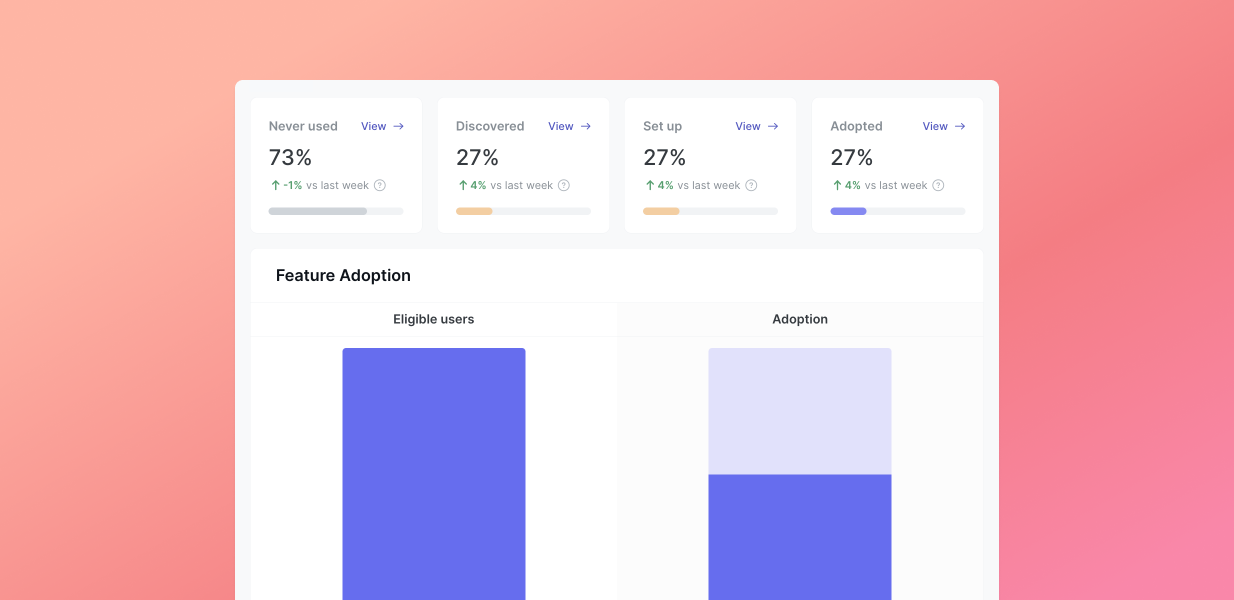
Home. A fixed view of report insights. To give people a way to get an overall sense of their product usage health. Each card corresponded to a single primary metric from a report.

June AI. Leveraging the power of ChatGPT in 2023. We enabled users to ask questions of their data to get specific answers, to alleviate the problem of reports not being customisable or being able to add insights.

v1 of June AI that lets you answer complex product questions using your favourite language: English. Feature living as standalone feature.

v2 of June AI. Returning to more familiar chat interface for users that already interact with AI. Also enabled better experience for iterating on prompt compavred to v1.
June AI didn’t work for a number of reasons such as inaccuracy of results, prompt education, performance, etc. But did win Product of the Day on ProductHunt.

Views, a replacement of our old Home. More customizable in terms of how many and what types of insights users want to add to their view…

But they were still tied to reports which came with all the existing constraints of reports, and added yet another product concept.
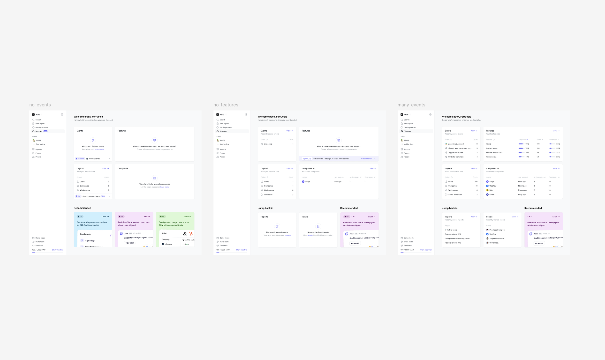
Discover page. Showing page what we hypothesised people needed to quickly find and making everything the product does more discoverable. Eventually removed after low adoption.

Exploring what if your home or dashboard was a feed

The tipping point. To make June company profiles more powerful, we built an insight builder for users to build their own custom insights WITHOUT having to create a full report. Video explaining why and how we built this.
Current iteration

The work around we did around company cards gave us the building blocks to eventually enable users create custom insight cards. Eventually extending this functionality to Views, and renaming to Dashboards to make product concepts easier to understand.


Craft is important. Designing details and interactions to work across different types of insight cards on company profiles and dashboards.
Extending dashboards

What I learned after interviewing a number of Customer Success:
ROI is central but hard to demonstrate
Health scores go beyond product usage data
Renewals drive language and actions and less “churn prevention”
CS teams are under resourced and struggle with prioritization
CS are highly involved in managing customer requests
Data fragmentation and manual input create frustration, obviously
The most painful and most ambitious problem to solve was around demonstrating ROI. We learned CS were already sharing screenshots of insights with their customers, so we stepped into this problem by extending dashboards so that they’re shareable externally. Things that come with that, making dashboard defined around a single company, adding notes, password protection, etc.


Results
Since focusing on Customer Success and Sales and serving these users better with our new dashboards and customer portals, 🔼 we increased the ACV of accounts by 4x and 🤑 increased ARR. These features are not why people buy June, but are helping during the sales process.